
All Else Constant is a series of data atlases experimenting with ways to tell political and economic narratives. The name is a play on the meaning of 'ceteris paribus', a term generally used in economics as a shorthand for exploring the relationship between selected economic variables and keeping all other variables fixed.
In late 2024, I came across a Gallup poll conducted in Sept 2025 stating that 52% of voters rated the economy as a significant influence on their vote for president. The percentage of voters who rated the economy as an extremely important factor in their decision to vote for president was the highest since 2008, during the Great Recession. This statistic was shocking to me because the economy in 2024, compared to 2008, was vastly different. Additionally, a quick look at recovery and the US was outperforming other major economies in the post-pandemic world.
Initially, I wanted to write this off as people falling for political propaganda. However, I couldn’t deny that 52% is a large percentage of the population and likely signaled that people were experiencing something that shaped their perception of the economy. And thus, this data atlas was born…
Role(s):
Creator
Designed for:
Responsive Web
Responsibilities:
Design Strategy, Data Integration, Interface Design, Coding
Links:
View Live Website
My approach with this project was to create a most minimally viable product that could potentially be tested for effectiveness. In order to do this I confined the scope to core features aimed at answering the questions in the problem statement.
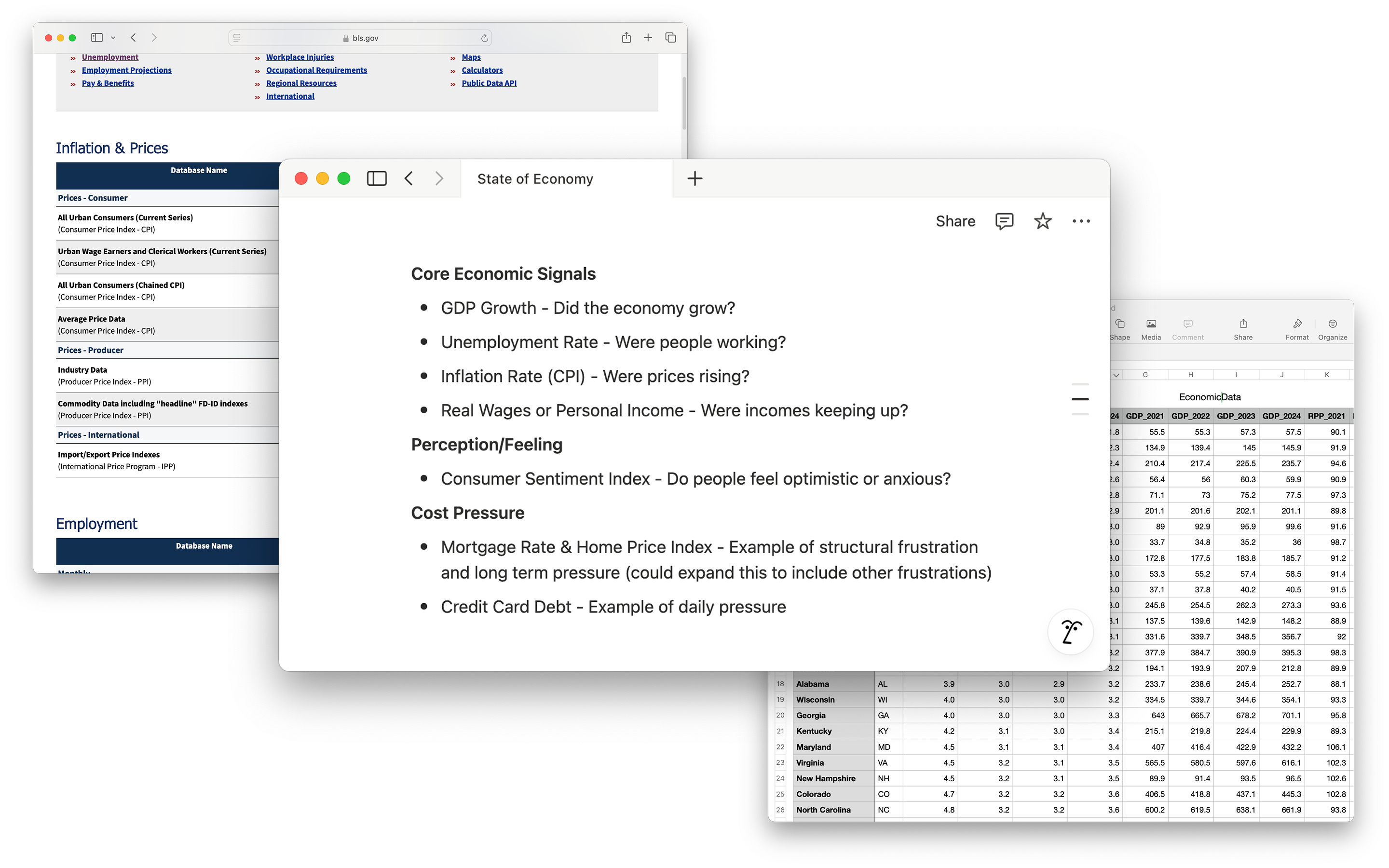
Put simply, a lot of this data was challenging to find. Most of the tools were outdated and lacked the necessary features at the required granularity. For example, initially, I anchored this exploration around three key data points and themes: GDP, Unemployment, and Inflation. However, Inflation was only available on a national level, which wouldn’t be helpful as a choropleth on a map.
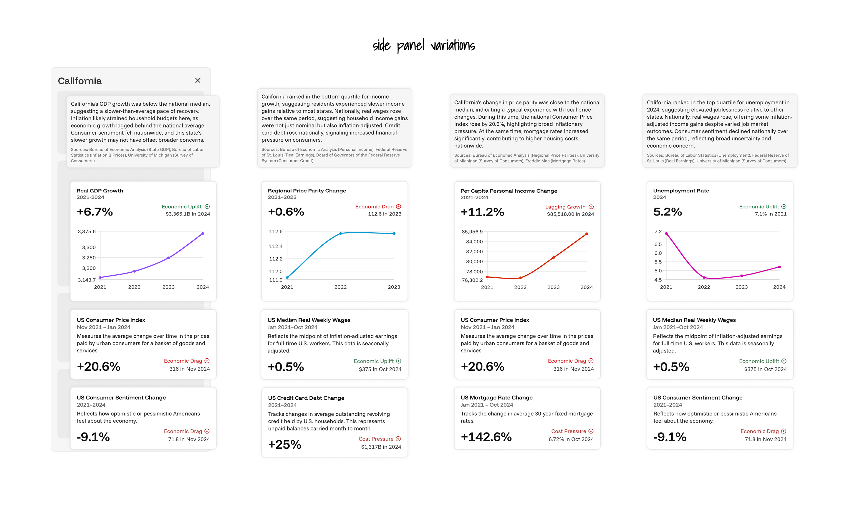
Solution: I organized the data around four key themes. Each theme had one choropleth and two supporting national indicators. This structure provided me with the flexibility to present information by state, and by utilizing related national data, I could add context.
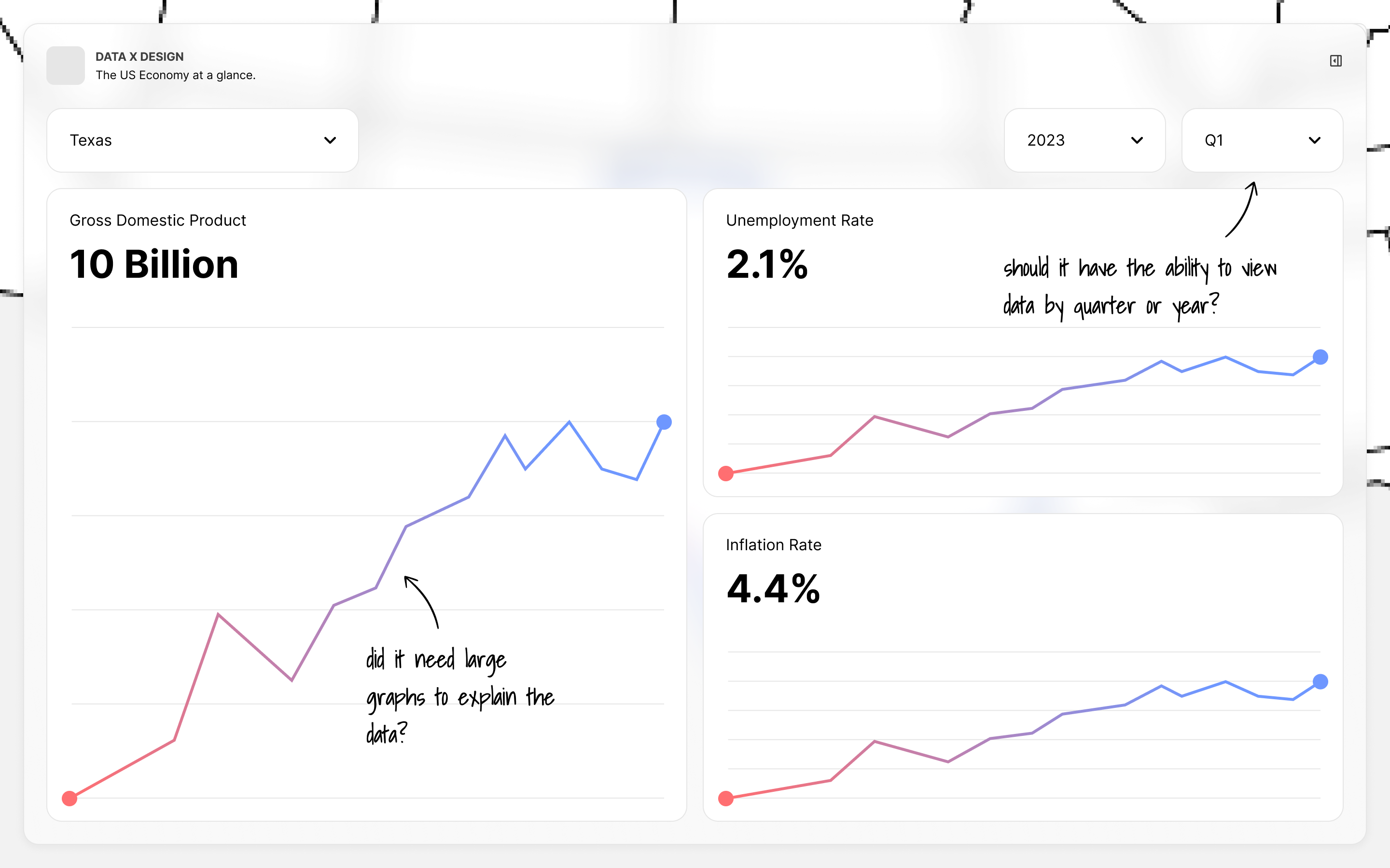
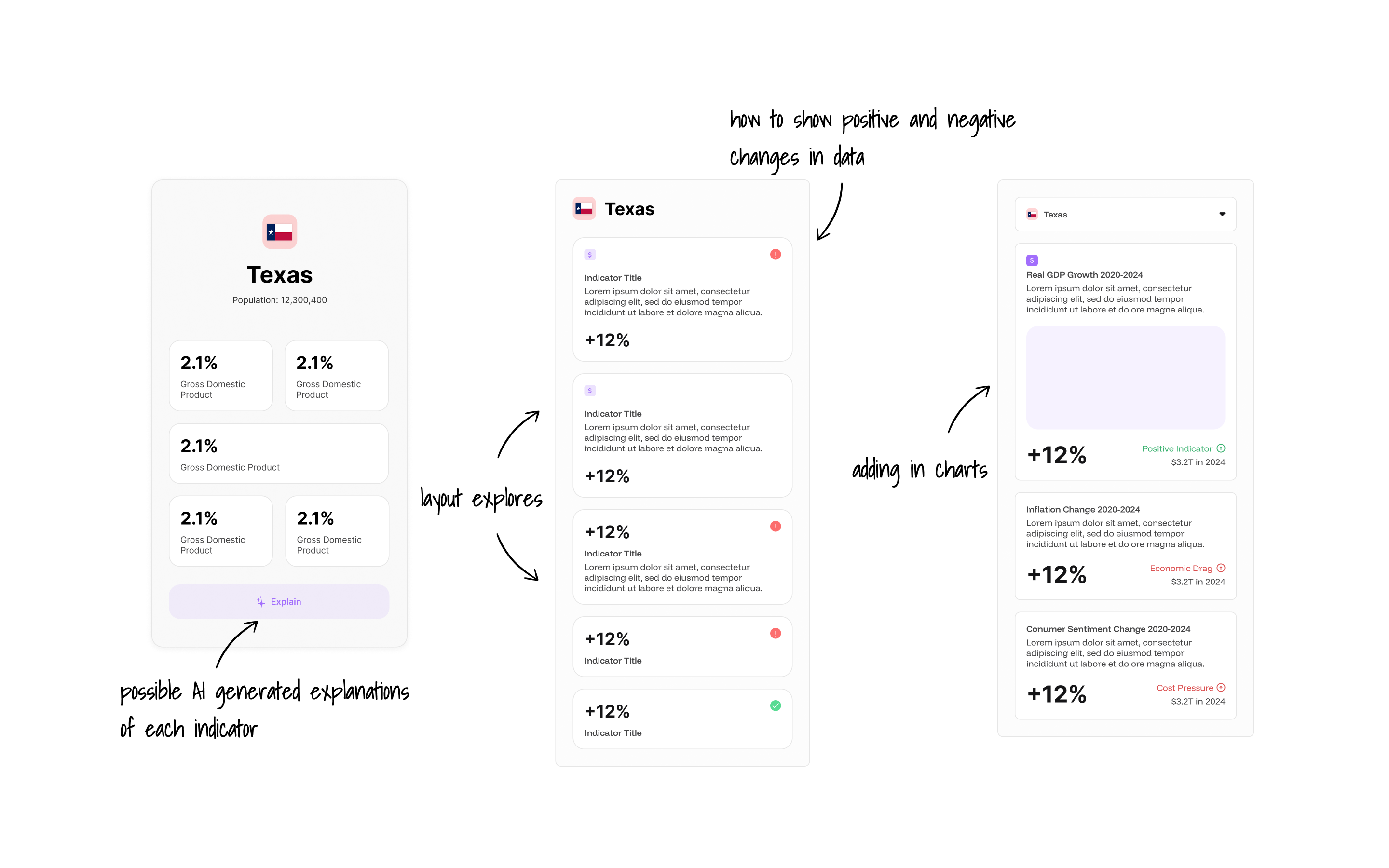
I had a lot of data. I knew that so much information about the economy, a topic that most people are not familiar with, can quickly feel overwhelming. I explored the cleanest way to tell the story through information hierarchy, slowly adding information until the narrative made sense, while being cognizant of concepts that required context to be understood.


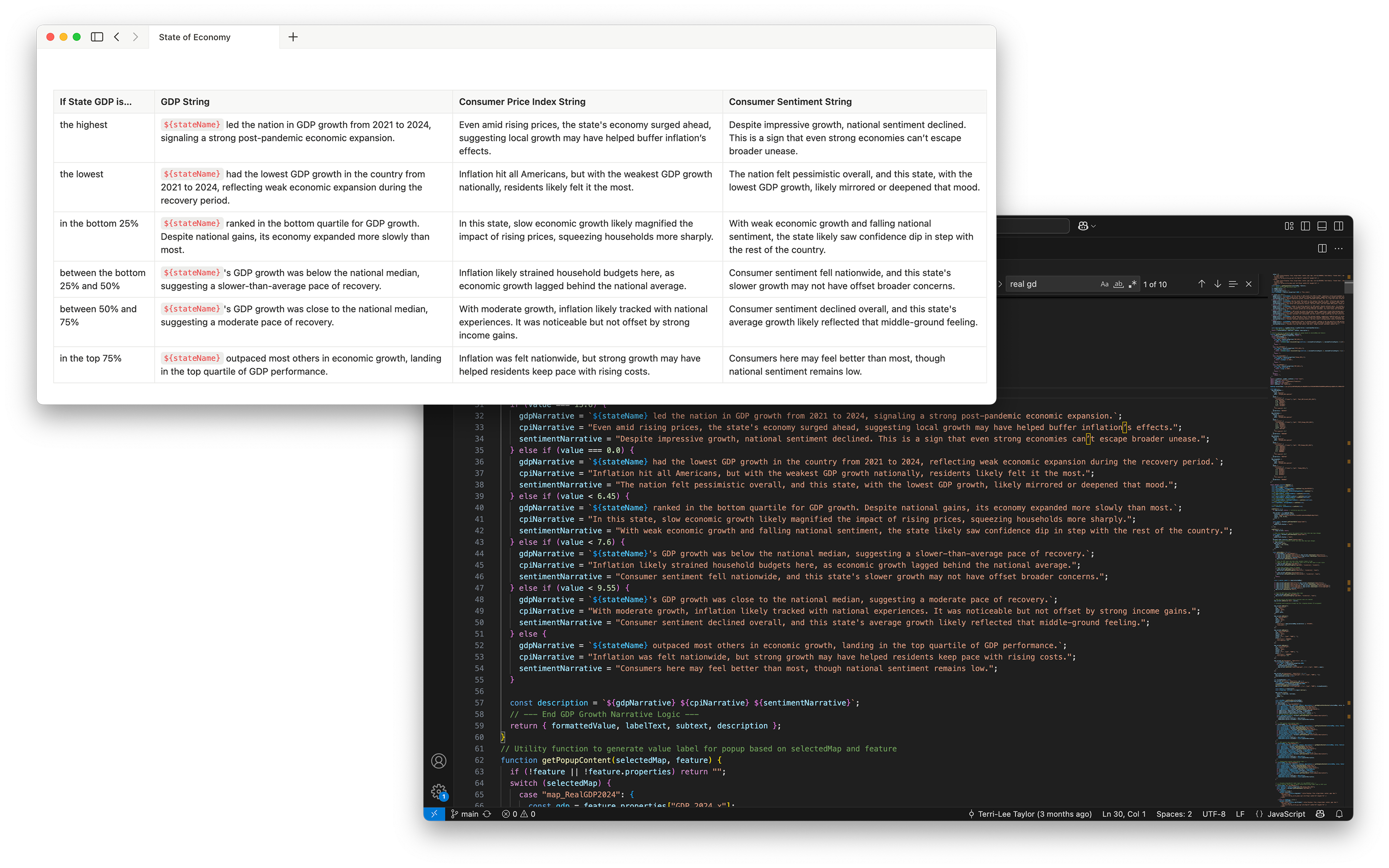
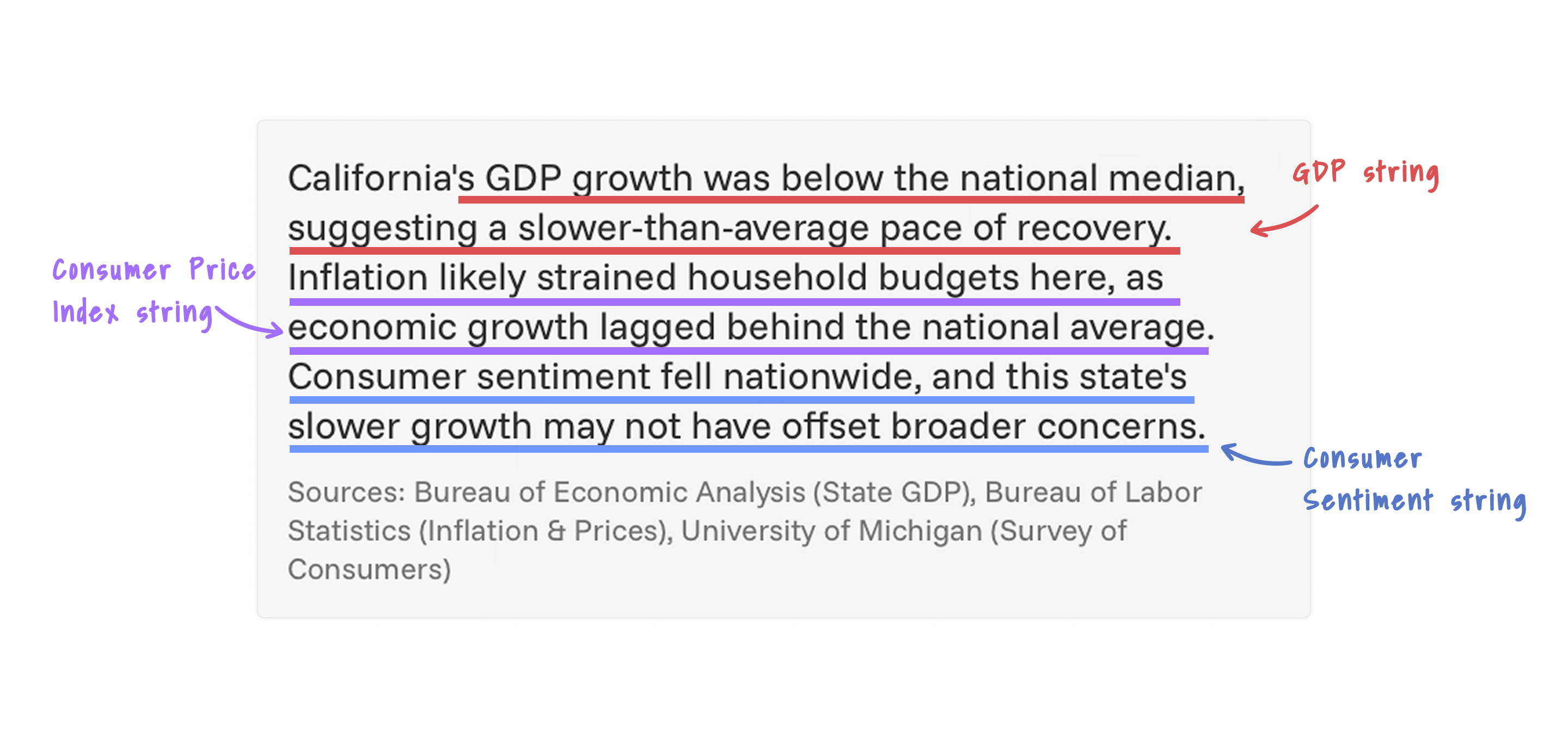
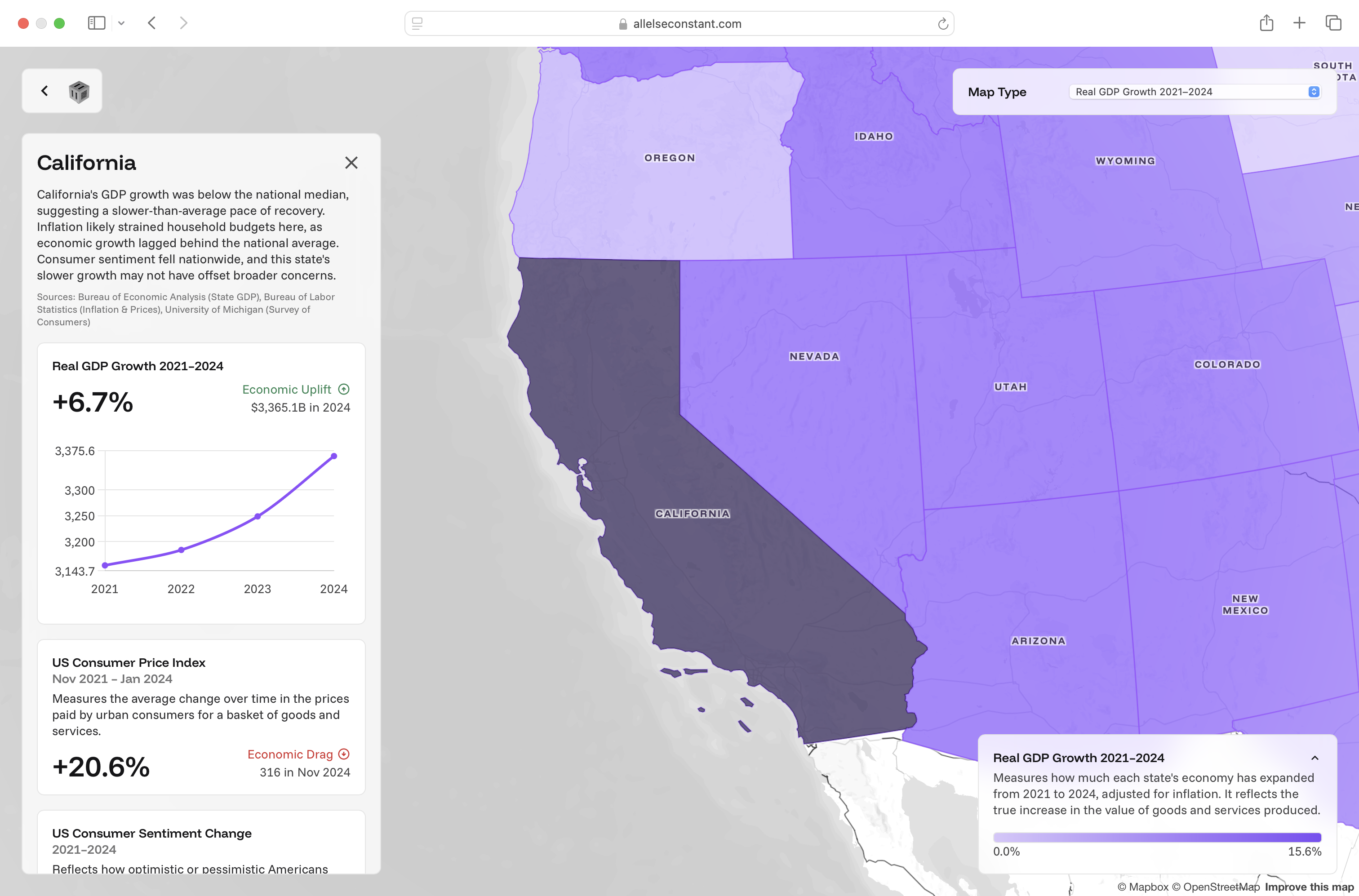
Solution: Much of the storytelling took place in the side panel. Each map had a side panel with three metrics. The first metric was always the same as the one shown on choropleth with a graph trending the data over time by state. The other two were national averages that complemented the narrative when combined with the state data. The dynamic summaries explained how each state compared to the others. I created these by dividing the states in each metric into quartiles and assigning a string to each quartile.
Each state needed a unique description for all 4 maps. Instead of creating and maintaining 200 unique strings, I managed them programmatically. Using Python, I divided the states into quartiles based on the data in each map layer and identified the highest and lowest performing states. I used Notion to track the unique strings assigned to each quartile and the extremes. I worked on the language to create consistent tone and flow so the descriptions would read naturally when combined in a paragraph. Then with ChatGPT's help, I wrote Javascript that displayed the combination of strings based on each state's performance.
With this approach, I only had to manage 24 unique strings across all 4 maps.
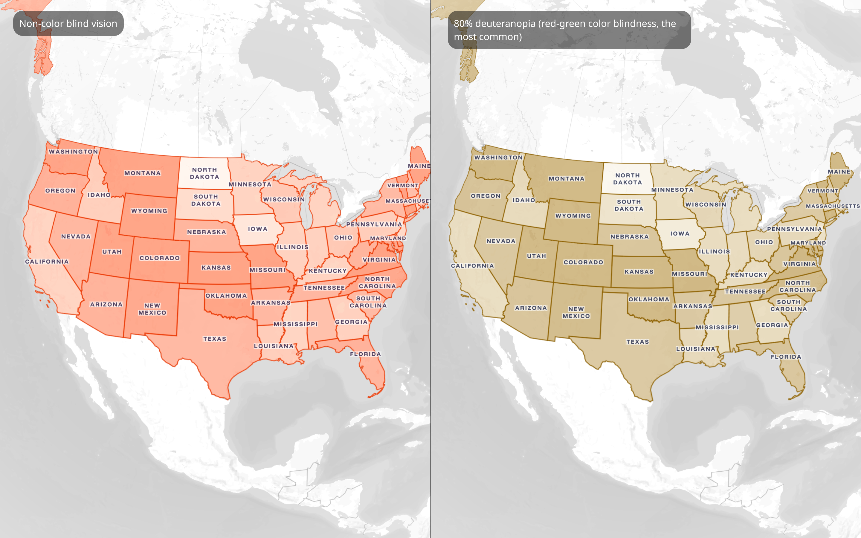
Although this was a proof of concept, I wanted to experiment with aesthetics to make the choloropeth accessible for people with visual impairments.
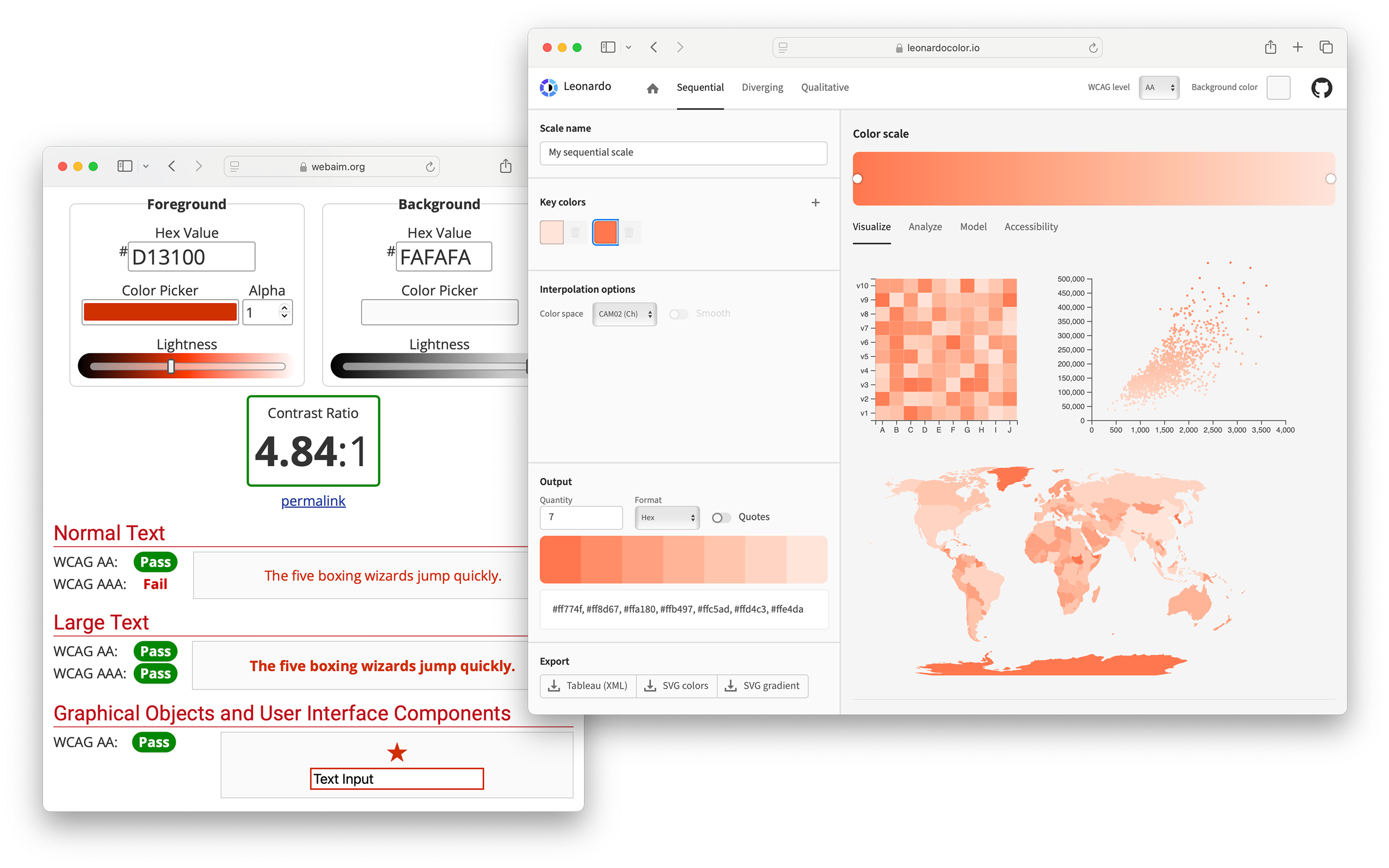
Solution: I found key colors that were high contrast against the grey and the white in the map styles. I also found shades of the main color with the lowest acceptable level of contrast and the lightest I was willing to go before the color became white.
I used main colors as the borders in the choloropeth. Then with the help of ChatGPT I wrote a Python script that divided the states into 5 equal groups for each map. I used Leonardo to find three colors from the shade with the lowest acceptable level of contrast to the lightest color, totaling 5 colors. Finally, I assigned each color to a group from lowest and lightest to highest and darkest.
This approach communicates key needs for my maps:
1. The boundary of each state indicating the affordance to click and learn more
2. Which states are darker or lighter to communicate lower or higher percentage changes.
View Live Site
I really enjoyed bringing this project to life. Reflecting on the frustrations that led to the creation of this first map, I have a more nuanced understanding of why most Americans felt the way they did. Despite general market growth, high employment, and stable income, cost pressures likely cause most Americans to feel poorer than they did 4 years ago. The economy performing well on the world’s stage doesn’t reflect the reality that many Americans experience today.
From an implementation perspective, this was the first time I had to interface with such a large amount of data. My original goal of using Mapbox to load the data without code quickly fell apart. I experimented with tools like ChatGPT to fill in the gaps of what I didn’t know, allowing me to focus intensely on the design strategy and sourcing data. Additionally, my approach of downloading CSVs and manually cleaning the data took several weeks and was certainly unsustainable. For my future project, I’d like to lean more on APIs and Python to speed up this part of the process.
In the future, I aim to investigate the relationship between how states voted and their economic performance.